NBC News Elections 2014
Managing deadlines and expectations while pulling off something exciting and new.
From stress to success
I worked on the midterm and Presidential elections for NBCNews.com from 2006 through 2012, covering historic results and creating engaging presentations with teams of talented folks along the way. In 2014, I noticed that the crew creating our elections site was falling behind schedule and needed help to hit their deadline, so I asked to be allowed to join them.
With limited resources and up against a tight, immovable deadline, I helped the team deliver an innovative, user-centric experience that pushed past industry standards and challenged commonly held assumptions of what election coverage needed to be.
We’ve got problems…
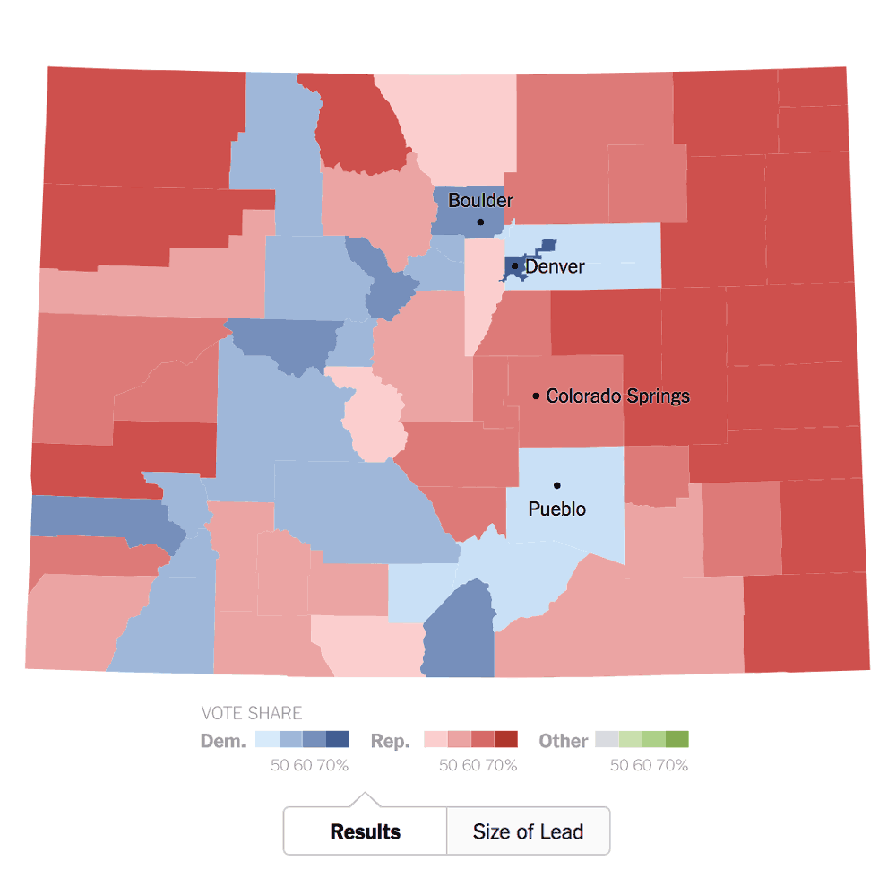
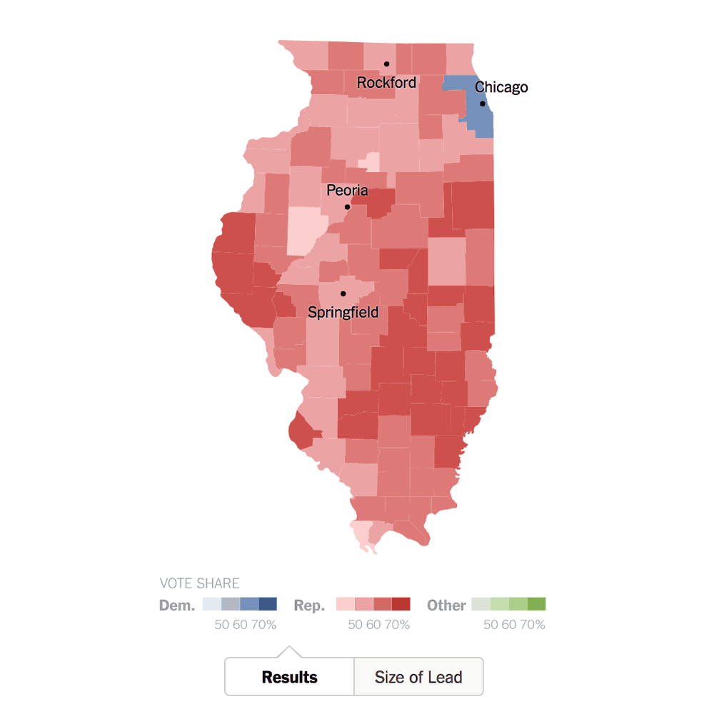
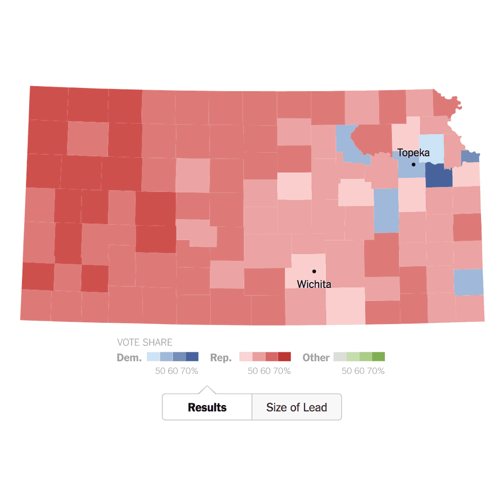
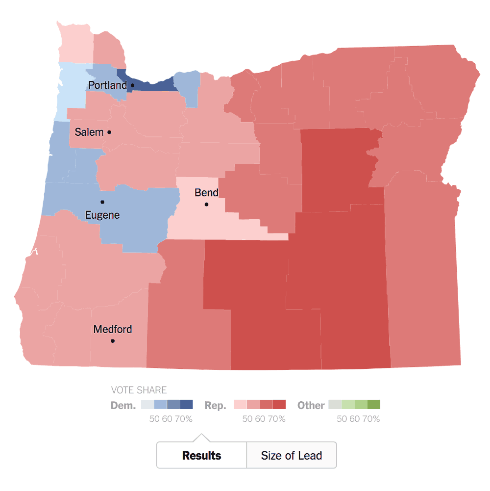
Don’t believe me? Look at the results below from the New York Times from 2014. They all look like blowout wins, but each was decided by less than 5% of the vote. Maps hide lots of information, and since geography and population don’t correlate there’s often an element to the visualization that’s misleading. Why do that to users?
When you’re lacking on time and resources that’s not ideal. We had to make some difficult decisions to find a balance between a minimum viable product and an ideal product deliverable, and then we had to get to work to bring that to life. Why add stress to your team and extra expense to your budget?
…I’m a problem solver!
Idea to execution
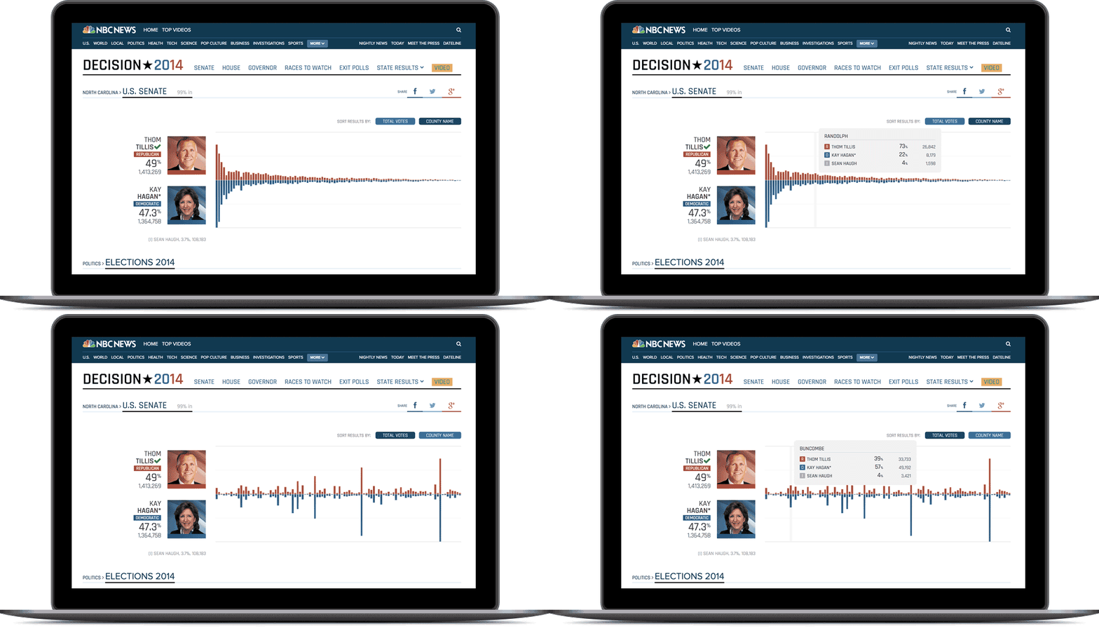
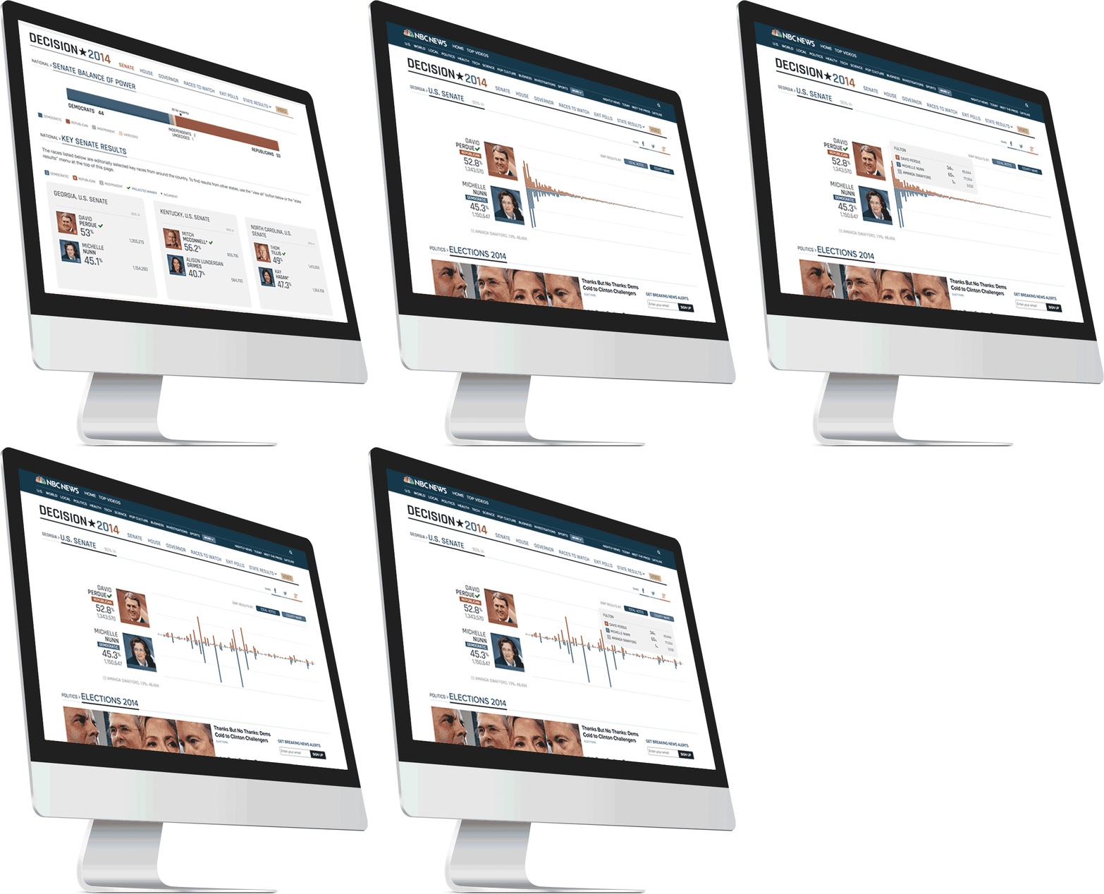
The higher ups at NBC News liked it, and it became our answer. Even better? We built it so that the data fed the tablet and mobile views. Cross-breakpoint deliciousness, served up in a package that helped users see the results more clearly.
A clearer picture
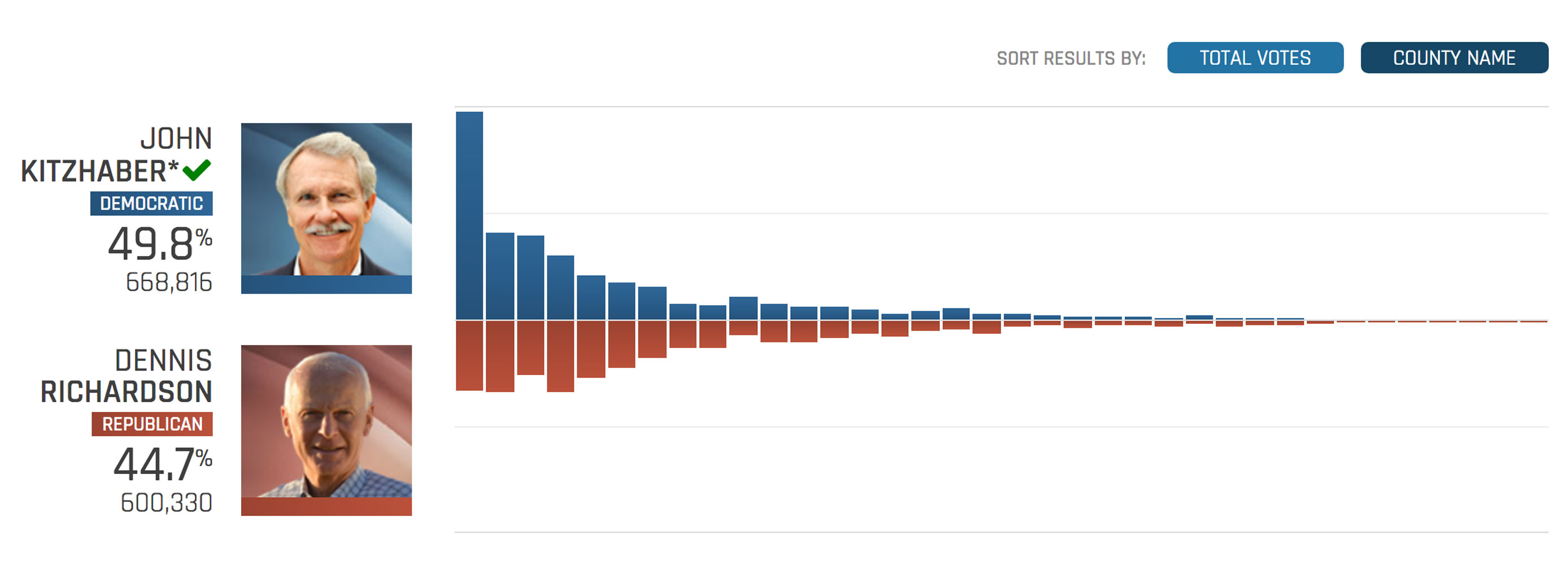
So much territory is red on the map that it seems like Republican candidate Dennis Richardson should have won handily, but a quick look at the chart shows just how Democrat Kitzhaber became Governor: he absolutely clobbered Richardson in Multnomah County, the most populous county in Oregon by far. That single county’s 120,000+ vote differential carried him to victory, a story that’s hidden in the map.
Understanding at a quick glance
My idea married data visualization and interactive storytelling to bring the election results to our audience in a simpler and more straightforward fashion. In short, it was better for the users and better for our team.
The process
Overview
I combined my UX/UI expertise with my skills in project management, content strategy, web development and collaboration to help my team create a unique, user-first election results experience.
New look and feel
I designed and developed a new user interface for the display of data on individual race results pages. Out with the maps and all of their headache… in with the charts and a clean, user-friendly data visualization.
Information architecture
I created an inventory of all of the content elements that would be necessary for each state overview and the House, Senate and Gubernatorial races across the country. I also helped to create a strategy for the overview and individual race pages.
Project management
Pressure and tight deadlines require clear, regular communication and well-defined objectives. We used Agile principles to keep us fast, flexible and working together to achieve big goals.
Leadership
As the member of the team with the most experience in elections development and design, I took over de facto lead of the front-end visualization to allow my teammates to focus on the work.
Tracking what to do
Each state has different races, and all of the moving pieces are difficult to track. I created Basecamp to-do lists for each race within each state and linked them with their associated tasks in GitHub.
